01. Brief
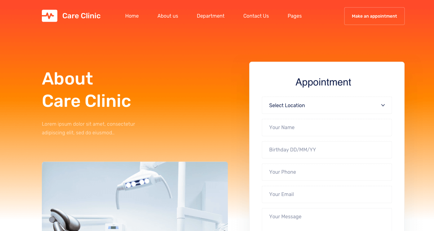
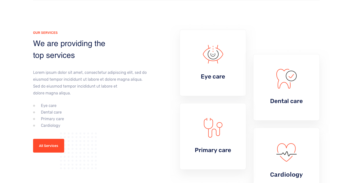
Developing a design for a medical website is not an easy task. You can find tens of thousands of outdated websites of private clinics and doctor’s offices on the web. Our client wanted to have a user-friendly website with an outstanding interface and individual features. Moreover, the website had to provide patients with interesting information on everything simply represented in the client’s clinic.
02. Process
1 Defining the goals and objectives of the medical site and studying the target audience
The definition of target audience gives an excellent idea of how a website should look like, what functions it should perform, what materials should contain. That’s why we revised the semantic core and filled the project with relevant content.
2 Add eye-catching, impactful photos, infographics, and videos to client’s articles to improve their content and readability.
3 Easy navigating the site is an invaluable guide for patients.
The navigation menu includes buttons that guide visitors and also let them know how to return to the home page. The modern business person won’t waste time studying the intricate structure of your site. He expects web designers to smoothly guide him towards his goal.
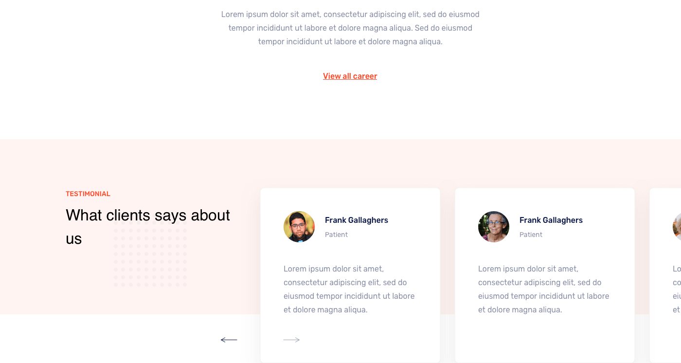
We brought the website to perfection, improved conversion elements. Using the accumulated UX experience of creating medical projects, we turned the clinic’s website into a sales tool. Which also looks great on any device.

Leave a Reply